This is a re-branding project for a small business that sells Outdoor & Sporting goods.
When determining the steps needed for this re-branding project, I had to consider if the current business had existing branding. Research showed that they did not have branding and little to no online identity. That is why the best option was a re-brand of the business. A new logo was created with a split-complementary scheme to bring out all elements representing an active lifestyle and outdoors. The design was inspired by someone running across the finish line and cheering. This helped create motion in the image. Then to represent the outdoor aspects of the business, I changed the body parts of the logo into nature elements (sun, water & mountains).
From there, choosing the wordmark fonts to go with the logo, I wanted to keep the boldness of logos from sporting goods businesses while also giving off a friendly presence. All the elements were cohesive and presented an identity for the brand.
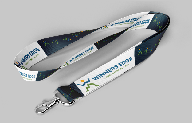
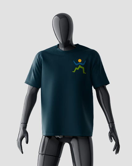
When creating the custom projects for the business, I explored the trends within the community where the business resided. It was found that most enjoyed lanyards to support and show off their local businesses. I then created t-shirts for the business to be used for the employees or as merchandise since they sponsor various sports teams in the town.
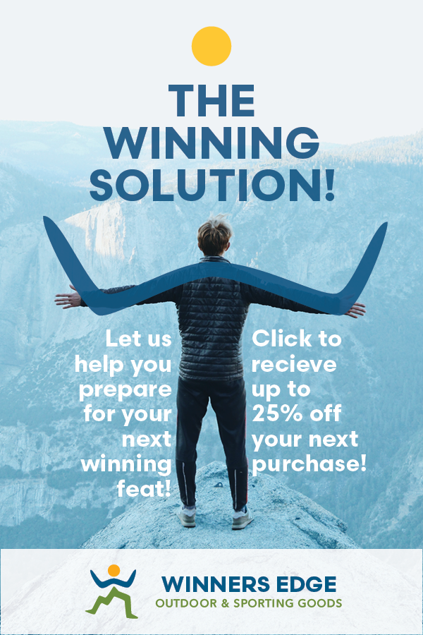
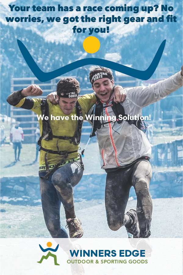
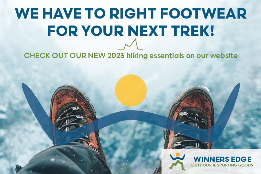
When creating the Advertising Campaign and Landing Page together, I had to ensure a call-to-action in each AD to entice the viewer to click and be directed to the page. To make the ADs eye-catching, I found having the top half of the logo and incorporating it into the movement of the picture helped direct viewers' eyes to the content within AD.
